Focus: Data visibility, user prioritisation, clarity of key SaaS metrics
Background
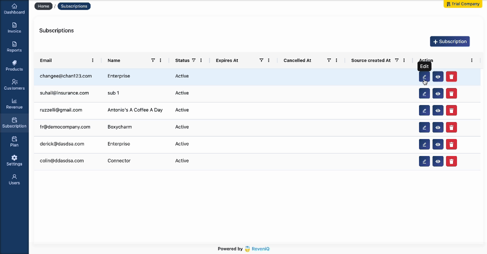
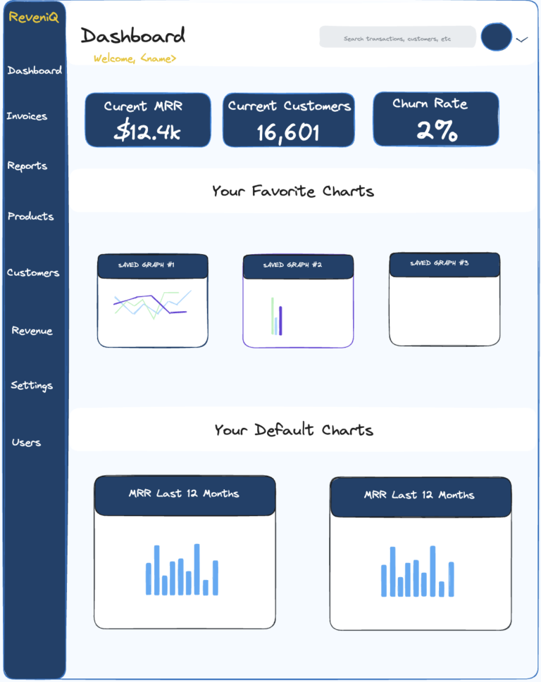
When I joined ReveniQ, the product had solid backend functionality: APIs integrated with Stripe, Xero, and Netsuite, and the system pulled financial data to calculate critical SaaS metrics like MRR, ARR, and churn rate. However, there was a major issue: Users had to hunt for insights.
Finance leaders and SaaS founders were logging in and facing a raw interface — powerful, but uninviting. There was no centralized home to see key metrics at a glance or easily jump into reports. That’s where this dashboard project began.
Design Objective
Create a dashboard homepage that acts as a single source of truth for users the moment they log in. The goal was to balance immediacy, clarity, and customization — serving both technical finance teams and startup founders with minimal SaaS experience.
Design Approach
1. Prioritize the “Why” — not just the “What”
Instead of dumping raw data, the dashboard highlights the three most critical SaaS metrics upfront:
Current MRR
Current Customers
Churn Rate
These metrics aren’t just numbers — they reflect business health, growth trajectory, and user retention.
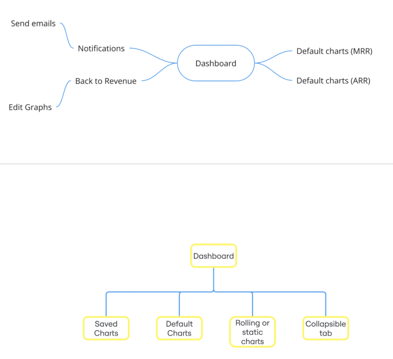
2. Split the dashboard into 2 layers of insight
Favorites section: Charts the user saves or interacts with most.
Defaults section: Charts shown by default for new users or accounts without preferences.
This structure gives new users a quick start while allowing power users to personalize their view over time.
3. Use modularity for scale
Every chart is designed as a modular tile, which can be reused, reordered, or swapped out. Each component was crafted with a consistent visual structure: header, chart, caption — ensuring simplicity and visual balance.
4. Emphasise simplicity and legibility
The visual style intentionally avoids complexity:
Soft background and strong data containers for focus
High-contrast number displays for top-line metrics
Legible, warm typeface (handwritten-style headings for warmth)
Familiar left-hand nav for predictable UX
This allowed non-technical users to feel confident and in control.
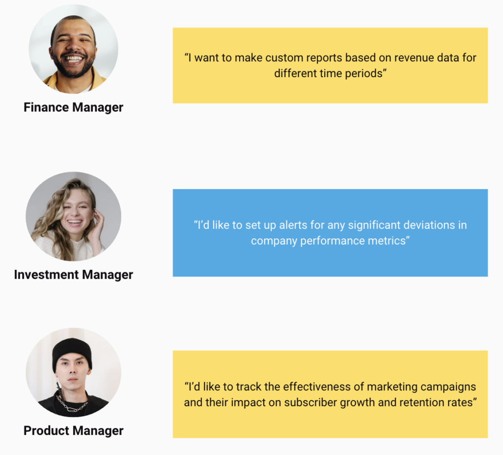
User Stories
An empathy-driven approach allowed us to tailor the analytics dashboard to address the specific challenges faced by financial analysts, investment professionals, and SaaS product managers, ensuring that the final product delivers actionable insights and meets the diverse requirements of its users.
User stories:
1) As a finance manager, I’d like to create custom reports based on revenue data for different time periods and departments.
2) As a financial analyst, I’d like to filter revenue data by different variables such as region, product line, or time period for better insights.
3) As an investment analyst, I’d like to view an overview of all portfolio companies with key performance indicators (KPIs) to assess their health and performance at a glance.
4) As a SaaS product manager, I’d like to analyze subscription metrics, including customer acquisition cost (CAC), lifetime value (LTV), and churn rates, to optimize our subscription model.
Ideation
An empathy-driven approach allowed us to tailor the analytics dashboard to address the specific challenges faced by financial analysts, investment professionals, and SaaS product managers, ensuring that the final product delivers actionable insights and meets the diverse requirements of its users.
3.1 Sitemapping
An empathy-driven approach allowed us to tailor the analytics dashboard to address the specific challenges faced by financial analysts, investment professionals, and SaaS product managers, ensuring that the final product delivers actionable insights and meets the diverse requirements of its users.
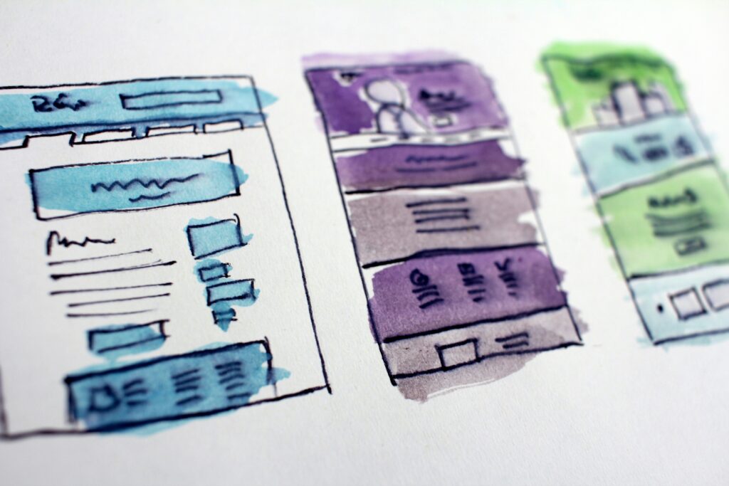
3.1 Wireframing
An empathy-driven approach allowed us to tailor the analytics dashboard to address the specific challenges faced by financial analysts, investment professionals, and SaaS product managers, ensuring that the final product delivers actionable insights and meets the diverse requirements of its users.
my Contributions
Created wireframes and prototypes (low and mid-fidelity)
Designed layout structure in Figma
Led user flow decisions (e.g., which metrics are most valuable to see first)
Worked closely with developers to ensure component responsiveness and API data mapping
Provided internal documentation on chart types, their meanings, and where they would pull data from
Takeaways:
Provided a clear “home base” for users that improved day-1 retention
Increased time-on-page and chart interaction by surfacing metrics immediately
Cut support requests asking “Where is my MRR?” or “How do I view churn?”
Created the foundation for customizable dashboards, which later became part of ReveniQ’s expanded SaaS analytics strategy