ReveniQ
Role: Product Strategist & Designer
Process
- Design Research
- Empathizing
- Ideating
- Designing
- Usability Testing

The Problem
Defining the problem statement was challenge #1
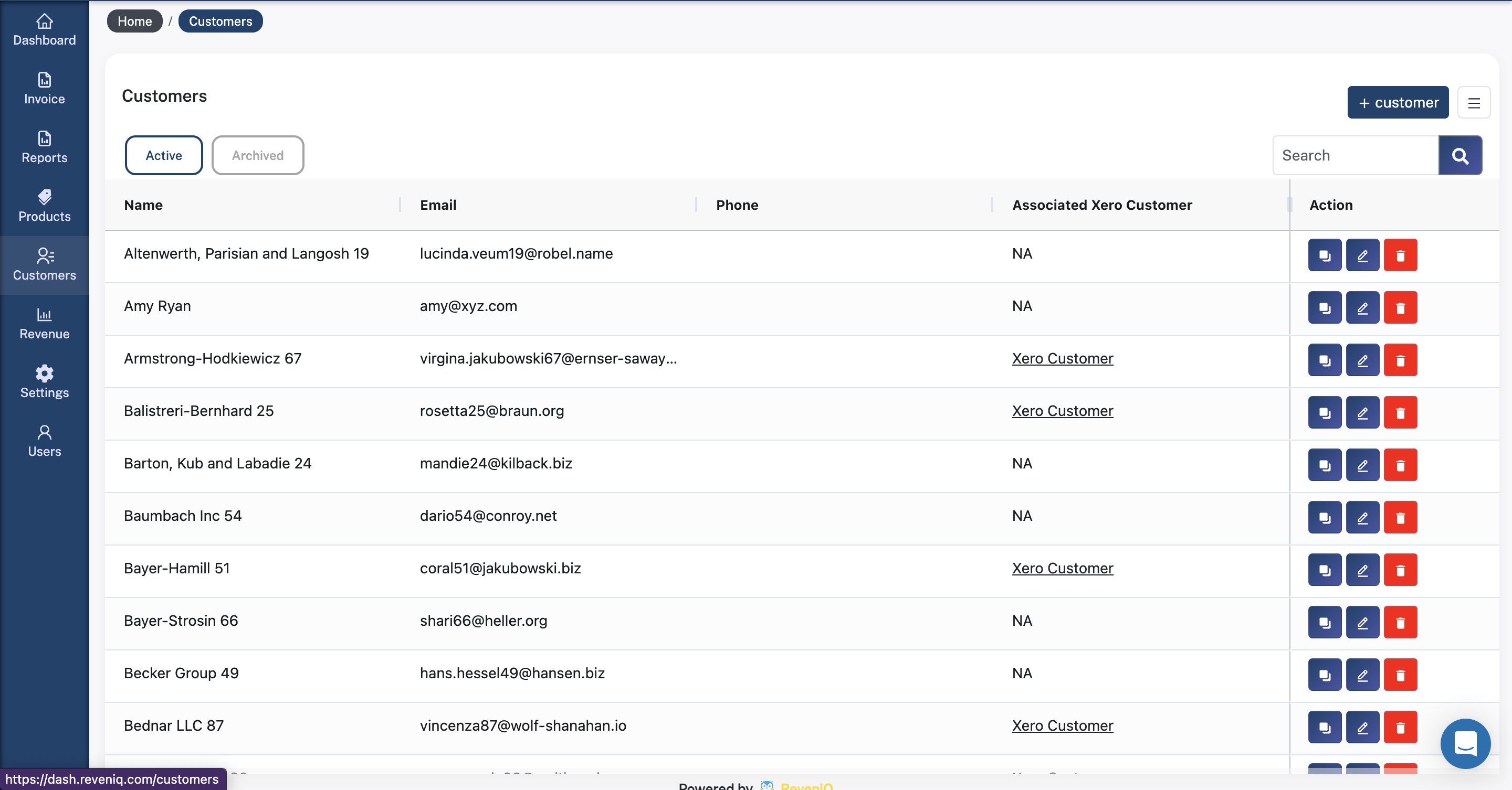
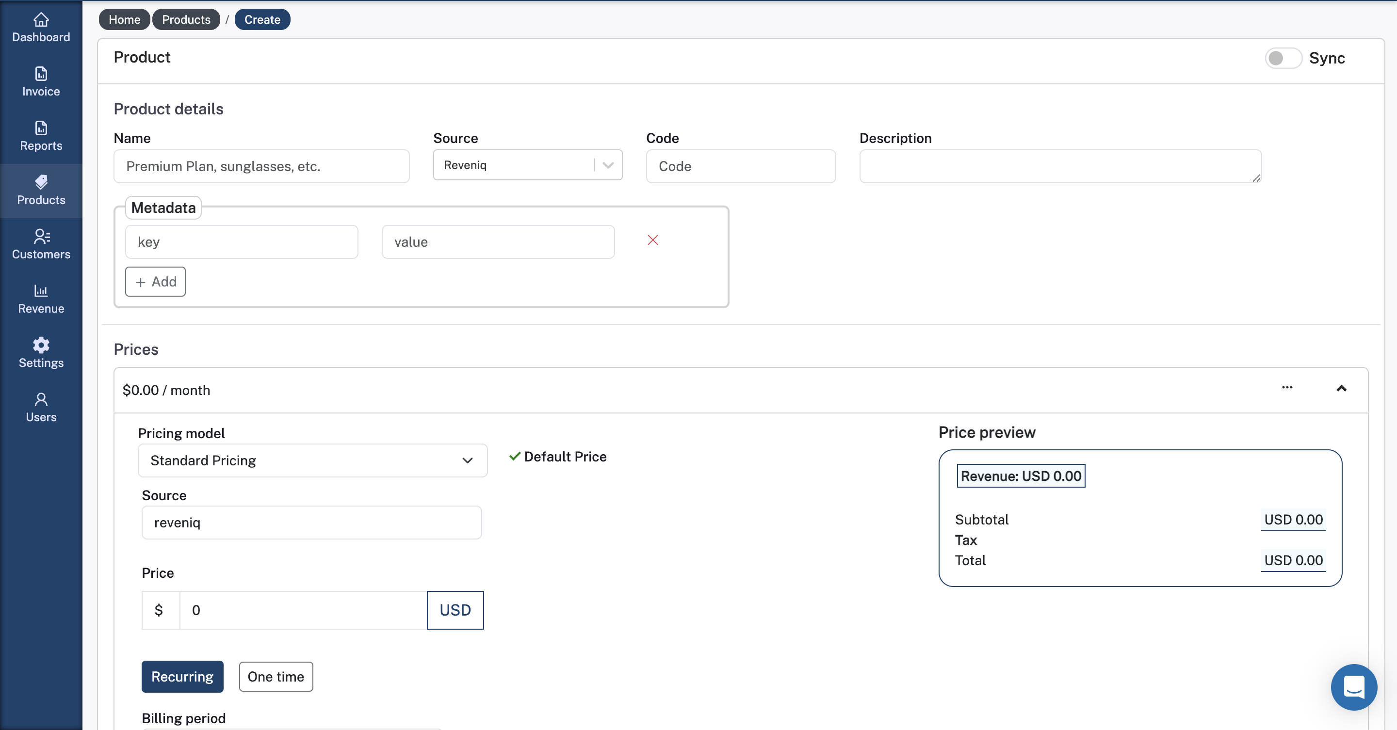
- ReveniQ had some core functionalities in place (invoice imports, customer & product data, and reports), but the dashboard lacked key SaaS tracking metrics and interactive graphs.
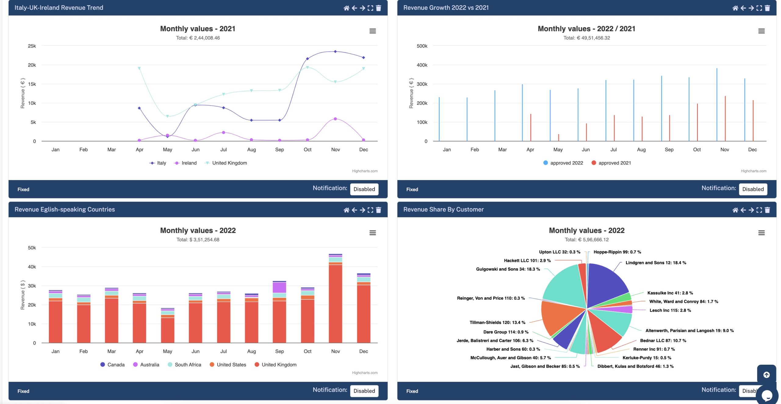
- Upon research, C-suite executives wanted real-time, customizable graphs for up-to-date decision-making, a feature absent from competitors’ tools.

The Solution
Finding the solution took much deliberation
I employed a rigorous user-centered design approach throughout the project. We developed a tailored analytics dashboard that is highly intuitive, clean, and adaptable, designed to integrate seamlessly with ReveniQ’s existing financial systems.
Most importantly, the final product enhances ReveniQ’s ability to monitor and optimize revenue streams, providing valuable insights that drive informed decision-making and support the company’s growth objectives.
Industry
B2B SaaS
Tools Used
Figma, Axure, Excalidraw
Duration
6 months
The Process
1.Research
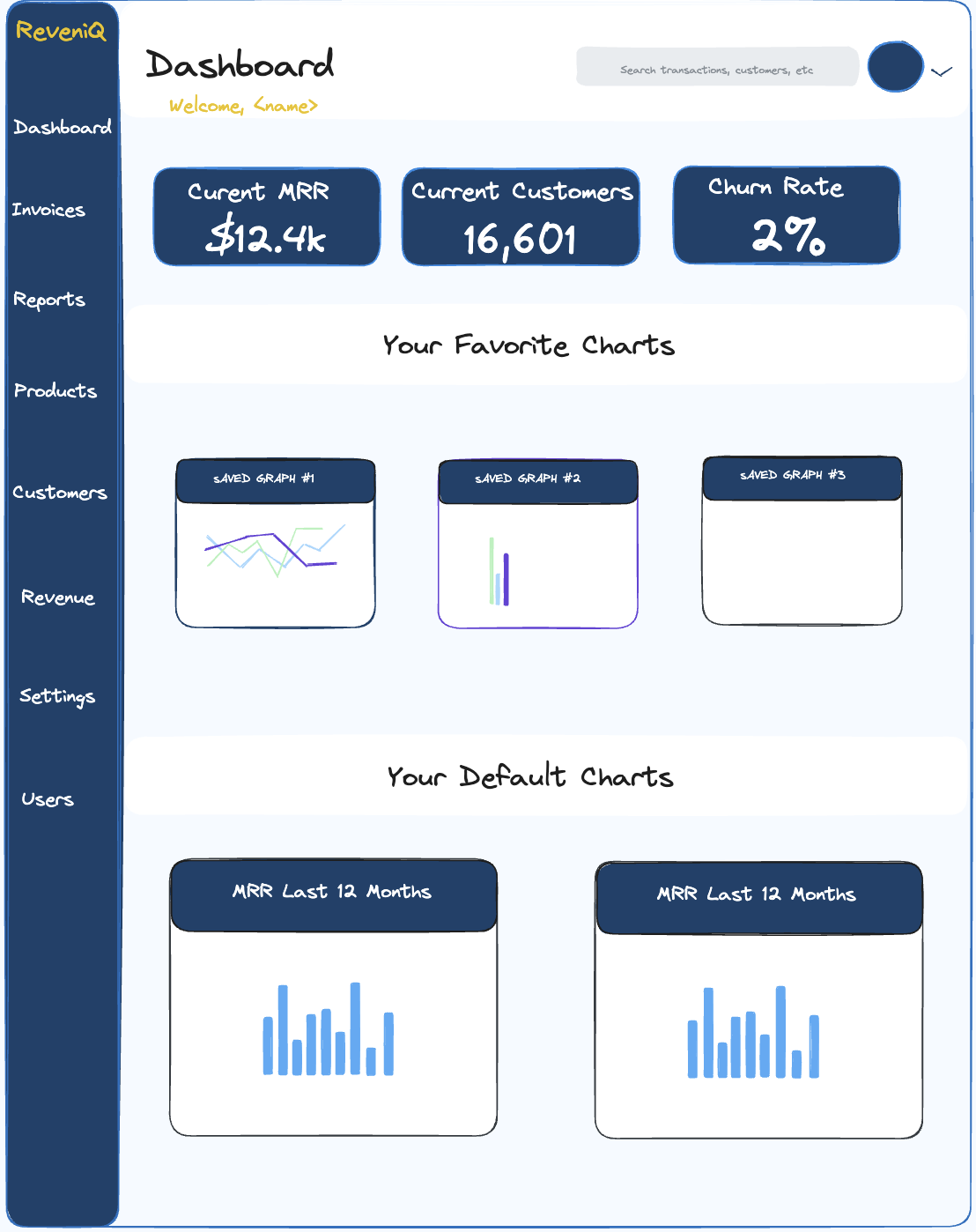
I started by exploring ReveniQ’s current setup and the workflows of financial professionals. Alongside this, we analyzed other industry-leading financial and analytics platforms to identify key features that the most effective systems share:
- Clarity in Visualization
To ensure usability, we focused on keeping visual elements clear and digestible by leveraging clean layouts, appropriate use of white space, and minimalistic color schemes. This allows users to quickly grasp key insights without visual overload.
- Intuitiveness in Design
Smart visual design isn’t enough to make a financial dashboard user-friendly. We prioritized the logical arrangement of widgets and tools to ensure that users can quickly navigate, analyze trends, and manage financial data without friction.
2.User Stories
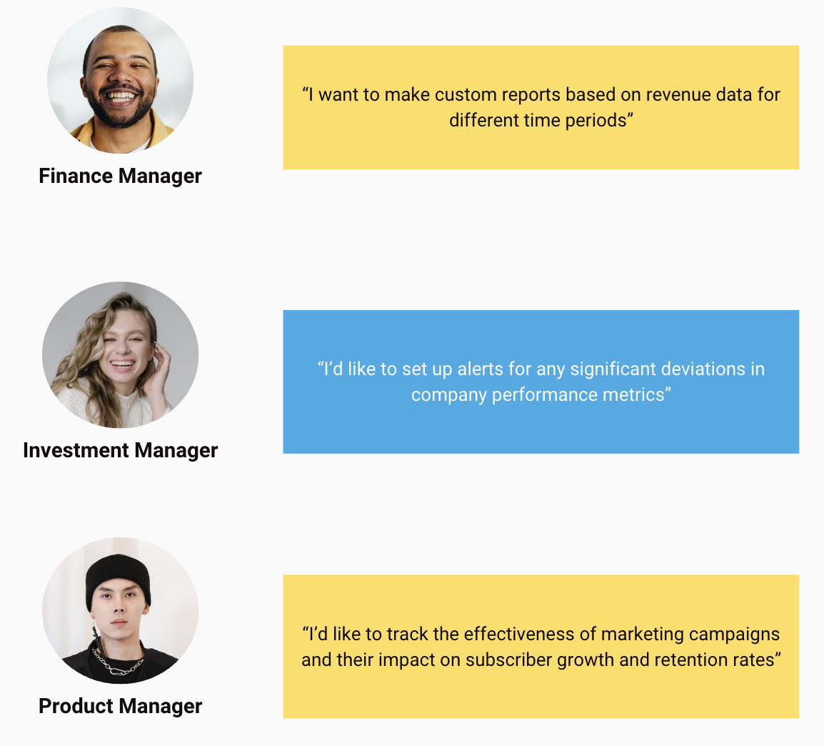
An empathy-driven approach allowed us to tailor the analytics dashboard to address the specific challenges faced by financial analysts, investment professionals, and SaaS product managers, ensuring that the final product delivers actionable insights and meets the diverse requirements of its users.
User stories:
1) As a finance manager, I’d like to create custom reports based on revenue data for different time periods and departments.
2) As a financial analyst, I’d like to filter revenue data by different variables such as region, product line, or time period for better insights.
3) As an investment analyst, I’d like to view an overview of all portfolio companies with key performance indicators (KPIs) to assess their health and performance at a glance.
4) As a SaaS product manager, I’d like to analyze subscription metrics, including customer acquisition cost (CAC), lifetime value (LTV), and churn rates, to optimize our subscription model.
3. Ideation
An empathy-driven approach allowed us to tailor the analytics dashboard to address the specific challenges faced by financial analysts, investment professionals, and SaaS product managers, ensuring that the final product delivers actionable insights and meets the diverse requirements of its users.
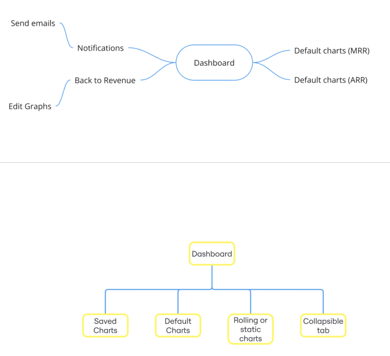
3.1 Sitemapping
An empathy-driven approach allowed us to tailor the analytics dashboard to address the specific challenges faced by financial analysts, investment professionals, and SaaS product managers, ensuring that the final product delivers actionable insights and meets the diverse requirements of its users.
3.2 Wireframming
An empathy-driven approach allowed us to tailor the analytics dashboard to address the specific challenges faced by financial analysts, investment professionals, and SaaS product managers, ensuring that the final product delivers actionable insights and meets the diverse requirements of its users.
