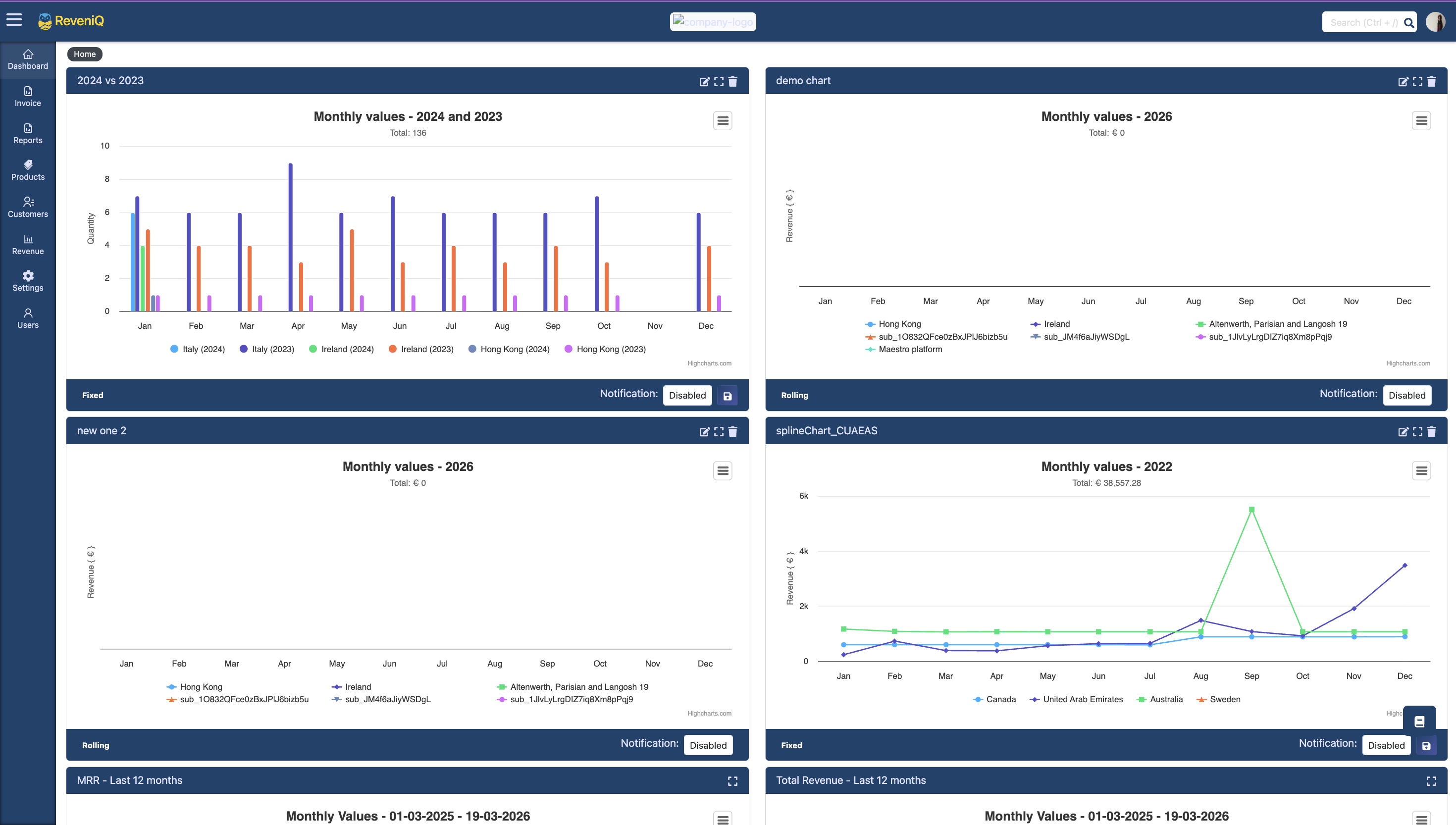
Dashboard redesign — a four-zone architecture
I redesigned the revenue breakdown dashboard around four functional zones, each optimized for a specific job in the analysis workflow. Instead of treating the page like one dense surface, I made it easier for users to orient themselves, filter data, change visualizations, and compare time periods without losing context.
- Conducted user research with SaaS finance teams to understand reporting pain points
- Defined the four-zone dashboard architecture to organize tasks by workflow intent
- Redesigned the primary analytics interface around clarity, speed, and comparison
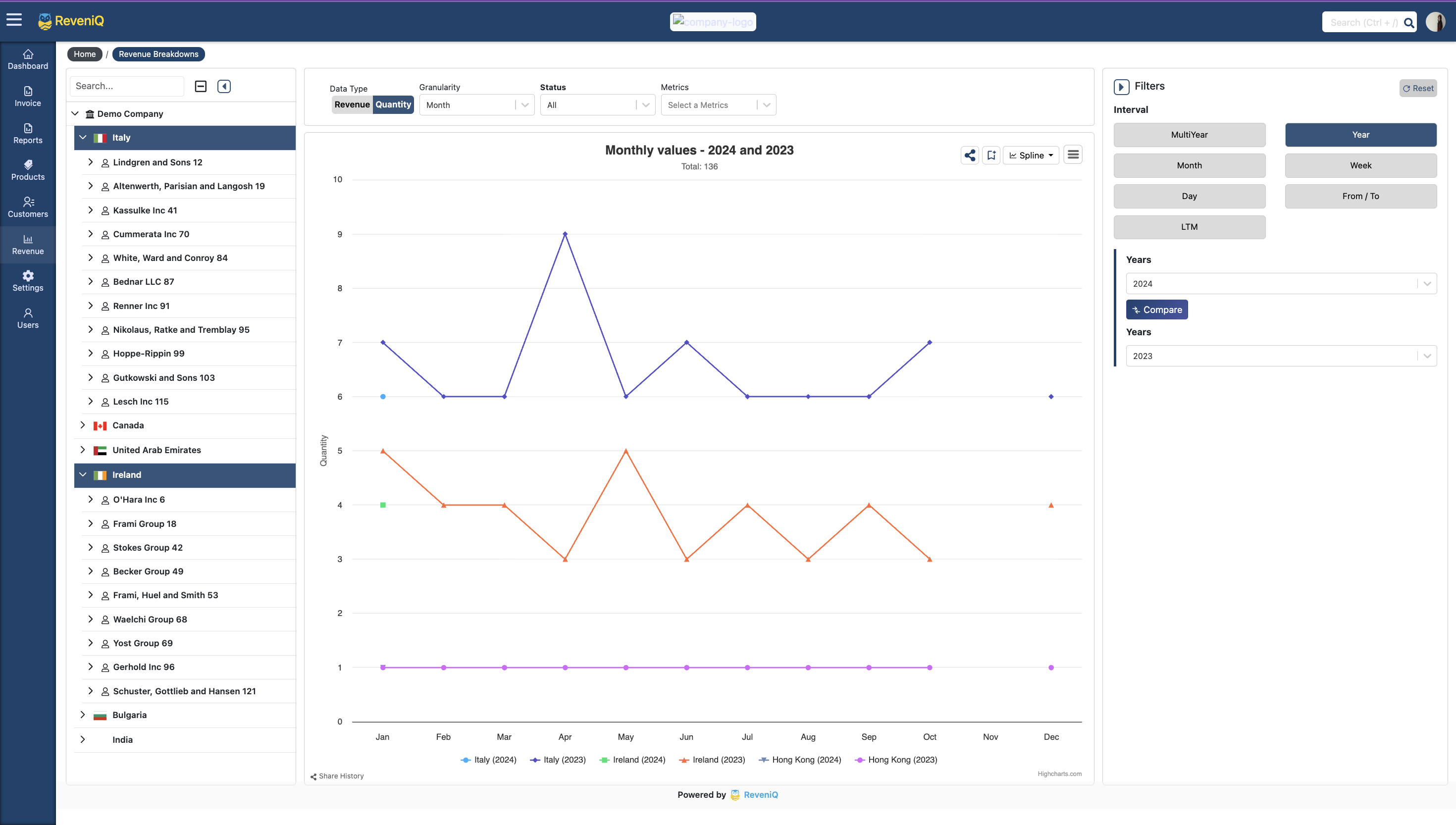
Zone 1 · Geographic filter
Used a hierarchical filter model — Global → Region → Country → City — so users could begin broad and progressively drill down without facing a wall of locations.
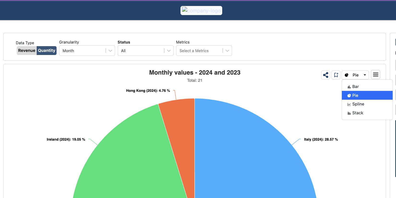
Zone 2 · Main visualization
Gave the chart area most of the screen because it is where insights happen. Supporting controls were organized around it instead of competing with it.
Zone 3 · Chart controls
Allowed users to switch chart types and save views without resetting their selected data, preserving flow for recurring analysis and reporting.
Zone 4 · Time controls
Supported interval switching, quick ranges, and compare mode so users could understand both current performance and period-over-period change.
Decision
Organized the interface by analysis task rather than by data source, reducing cognitive load for finance users who cared about answers, not system structure.
Why it matters
This work demonstrates product thinking at the workflow level: not just “better charts,” but a clearer path to insight and faster recurring reporting.