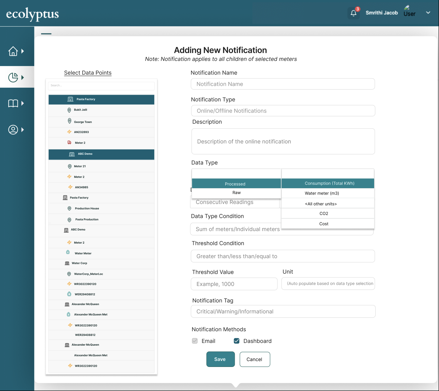
01
Core Analytics
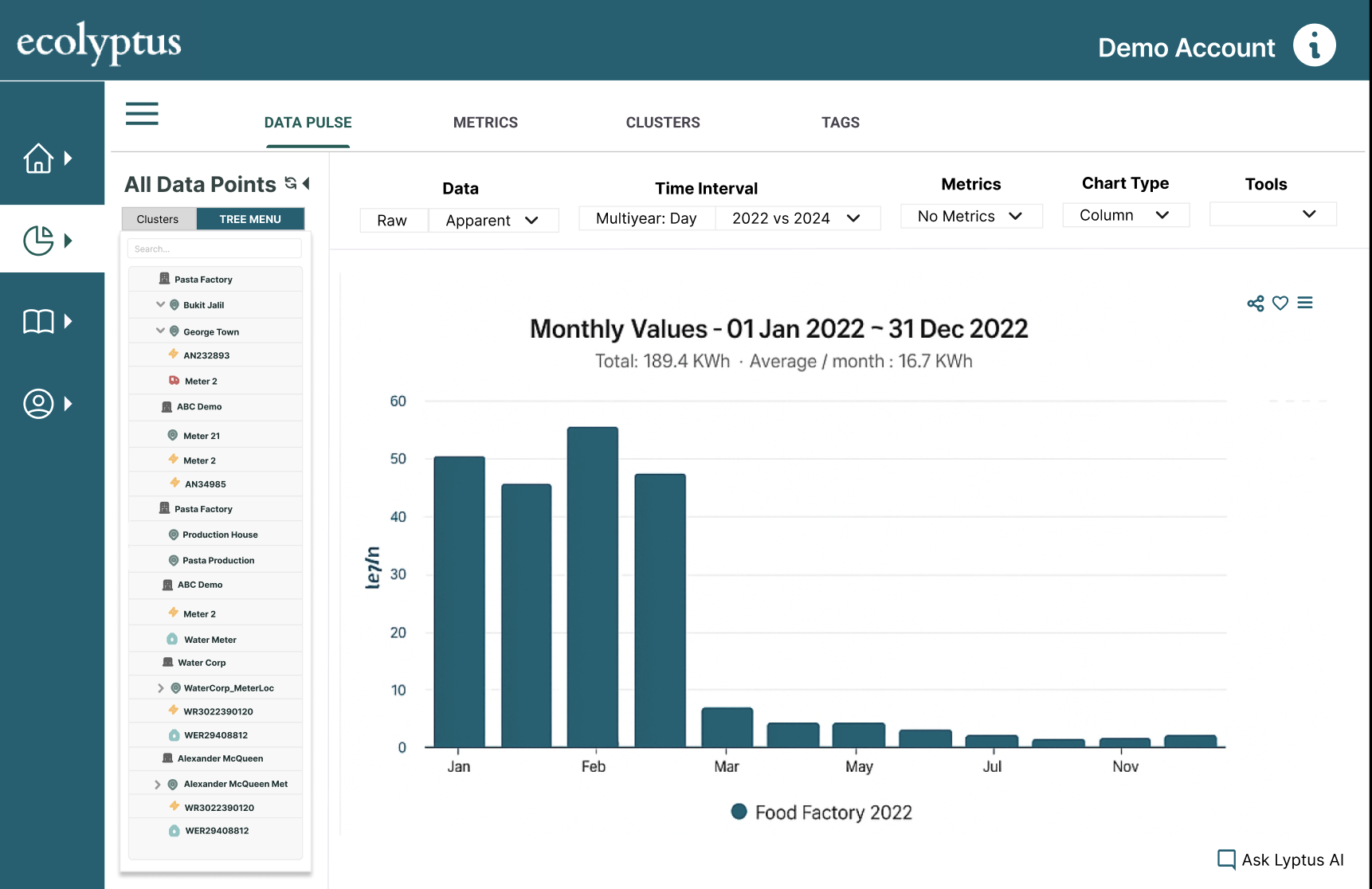
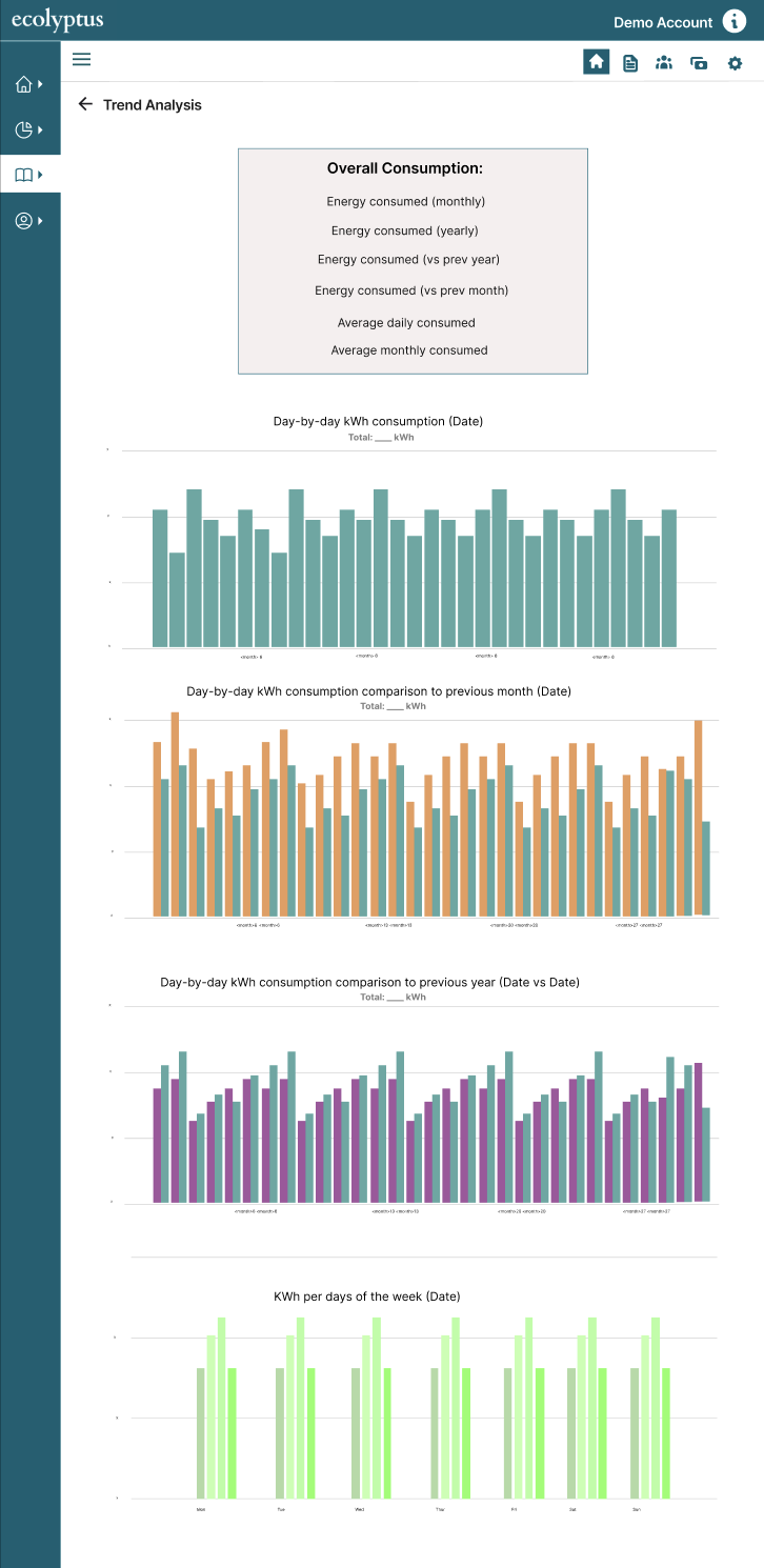
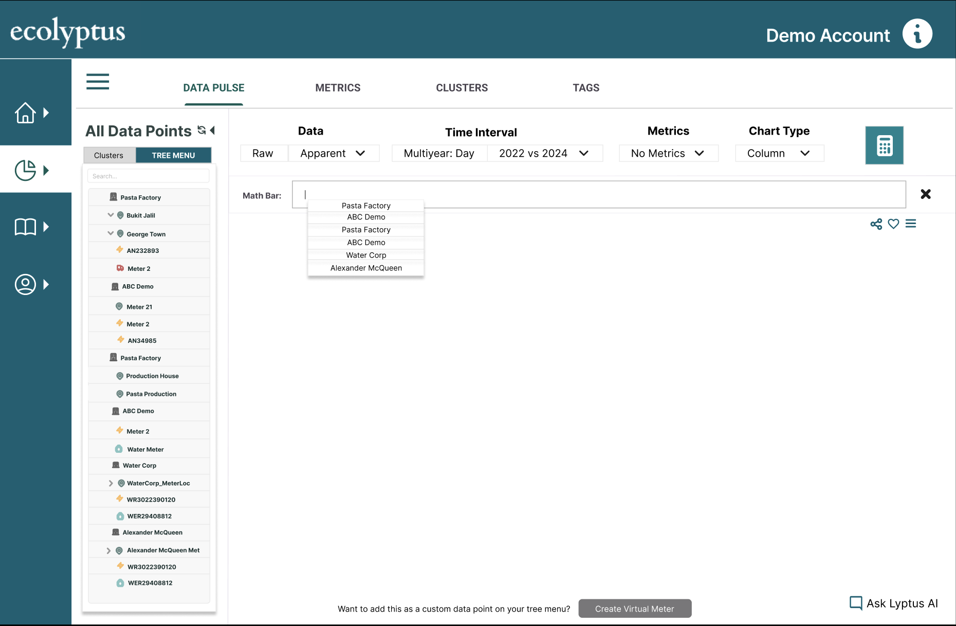
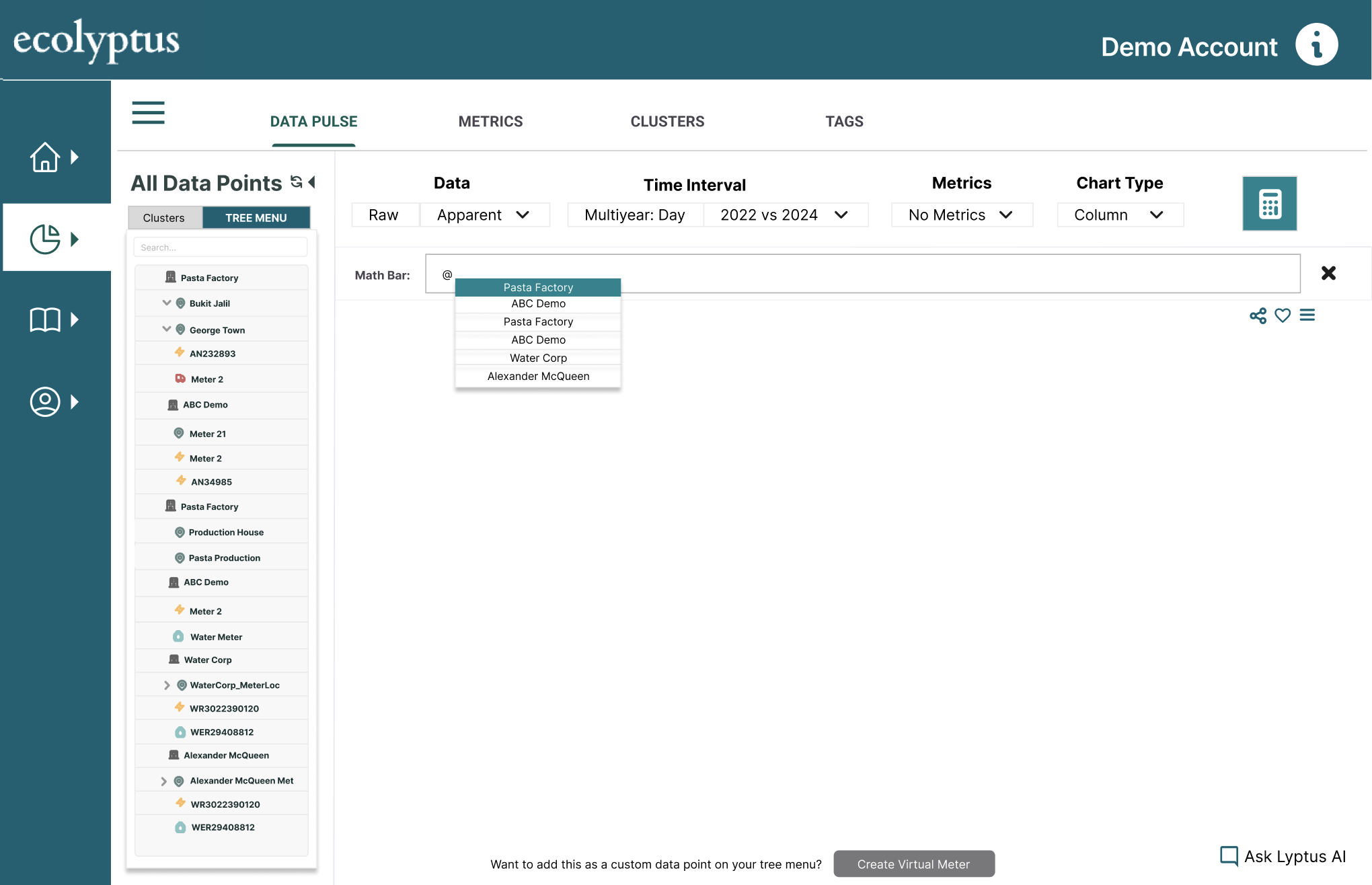
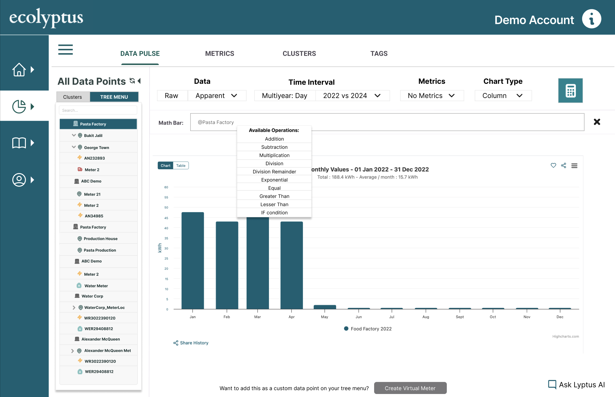
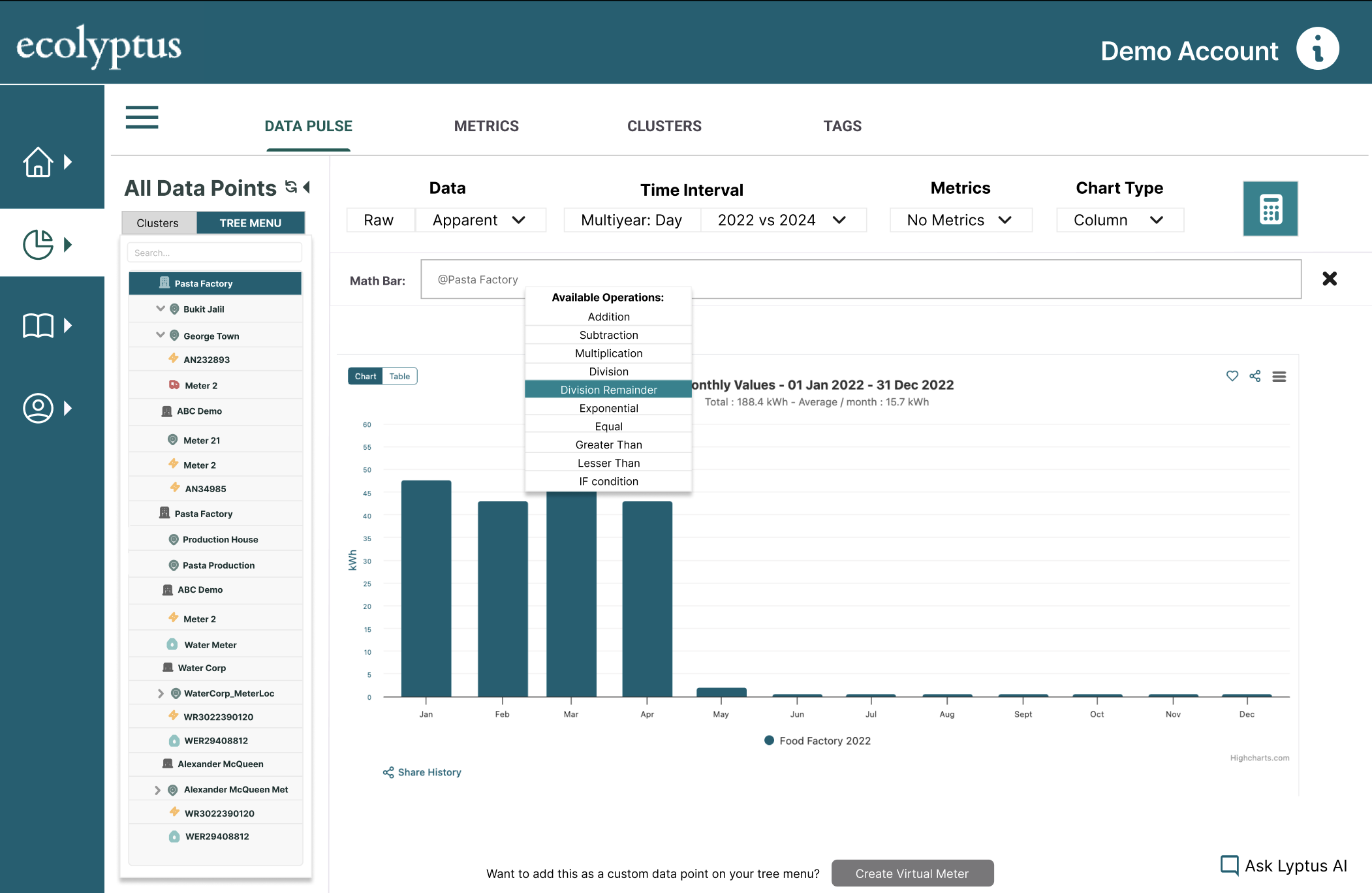
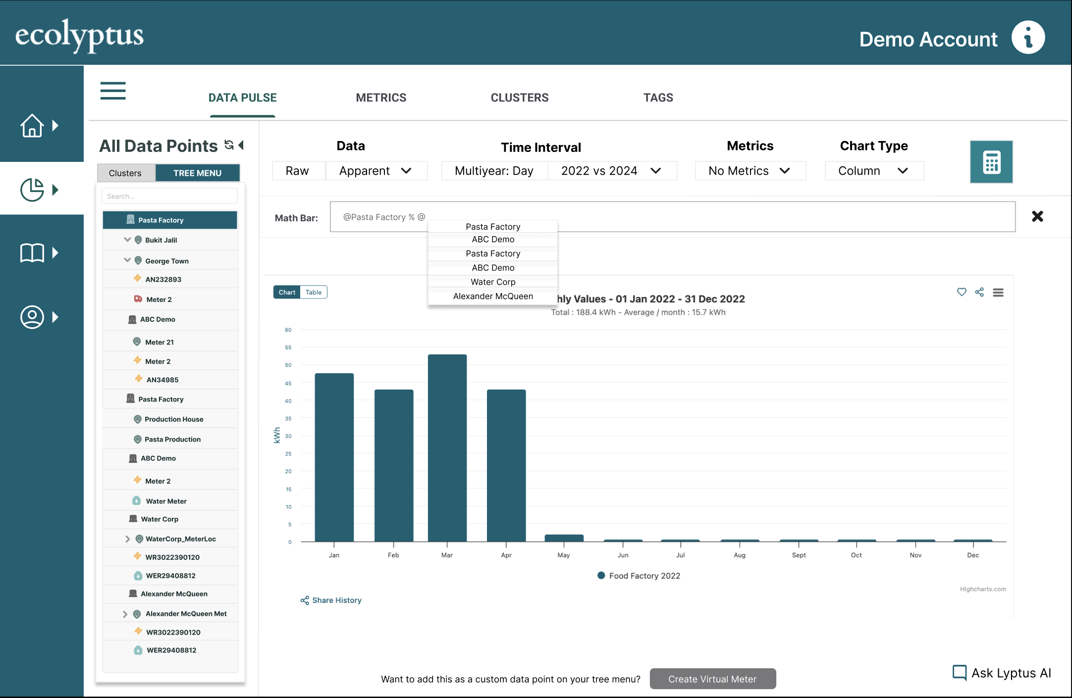
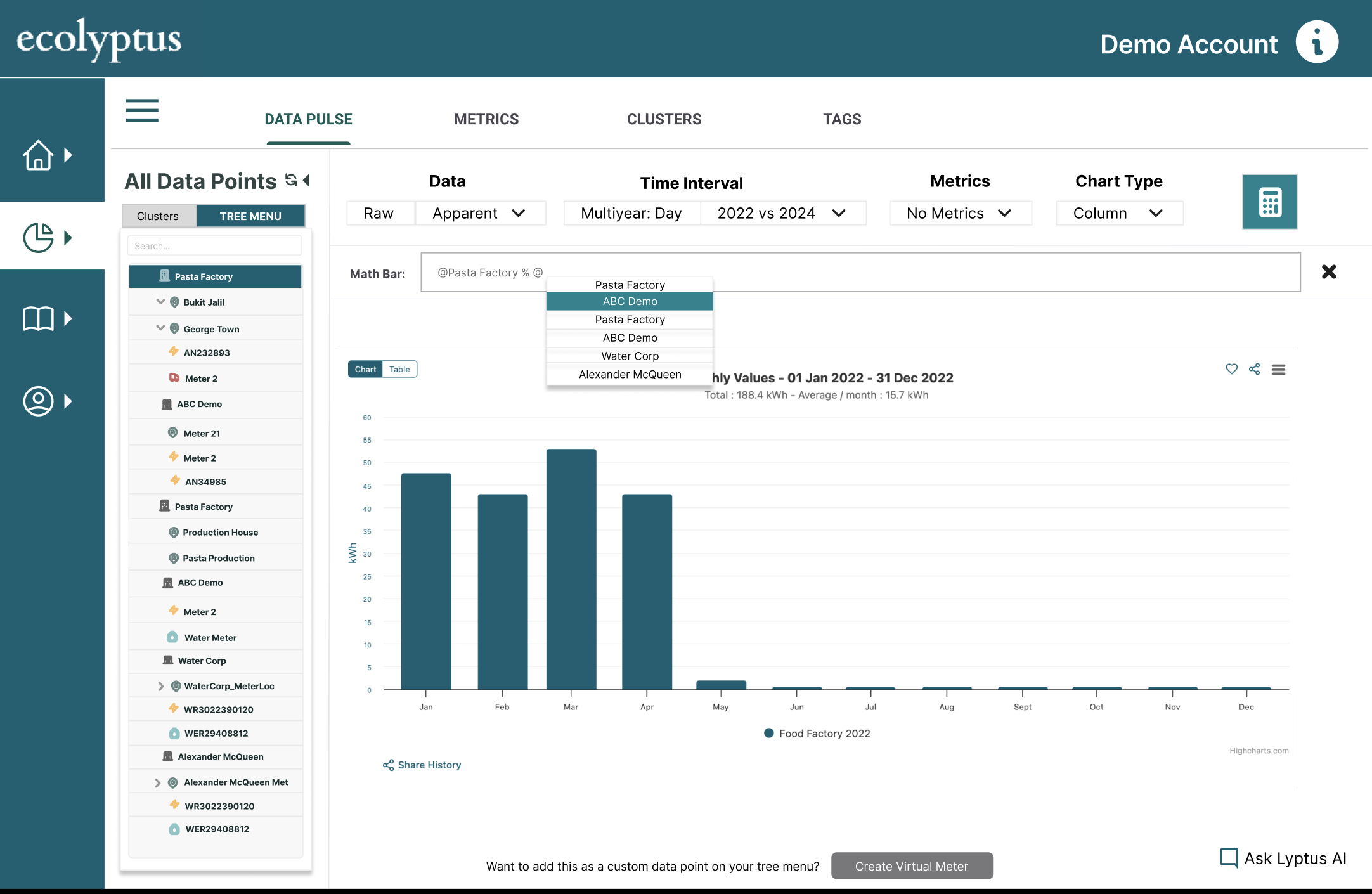
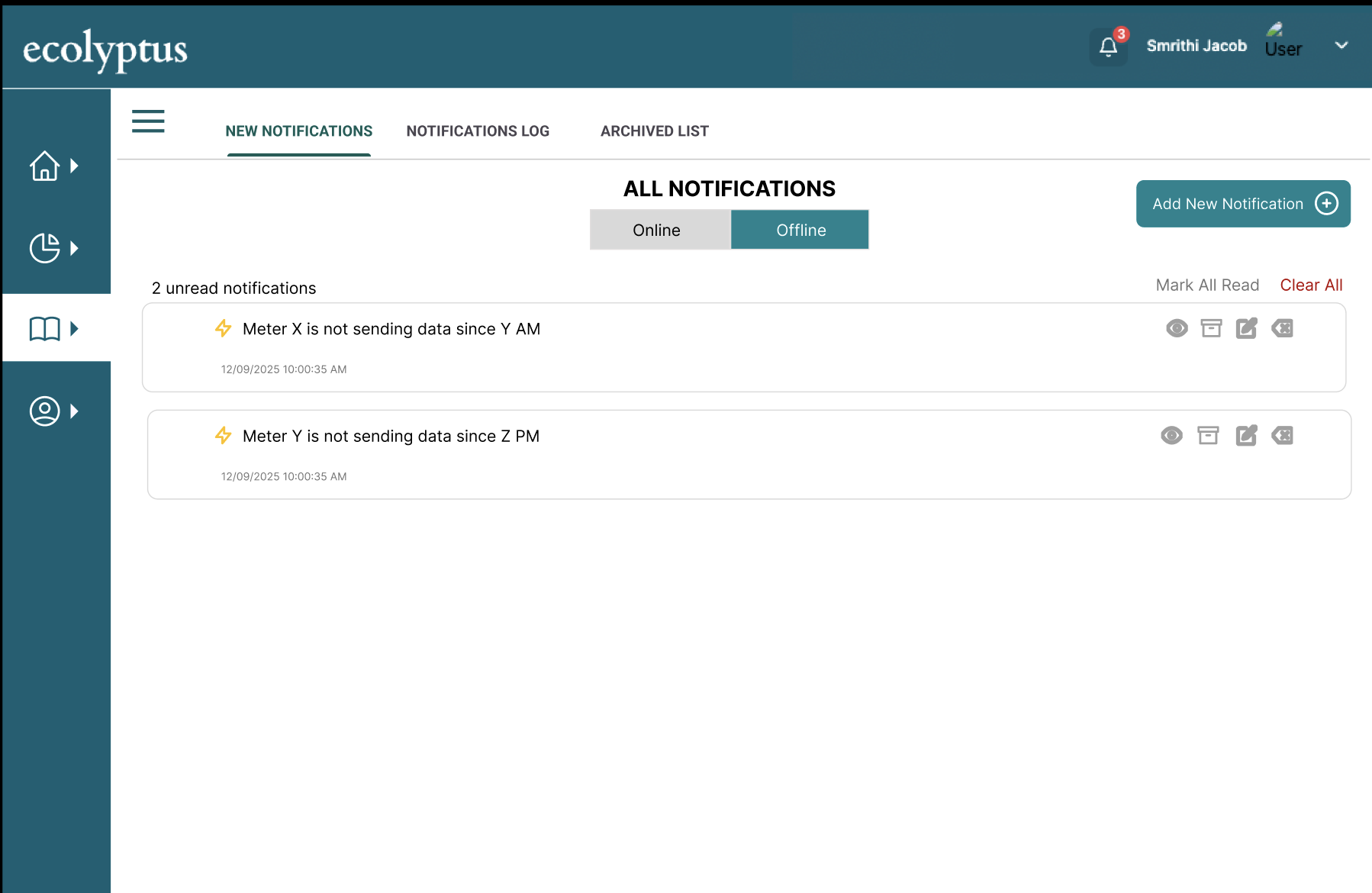
Data Pulse — Exploring energy data at any resolution
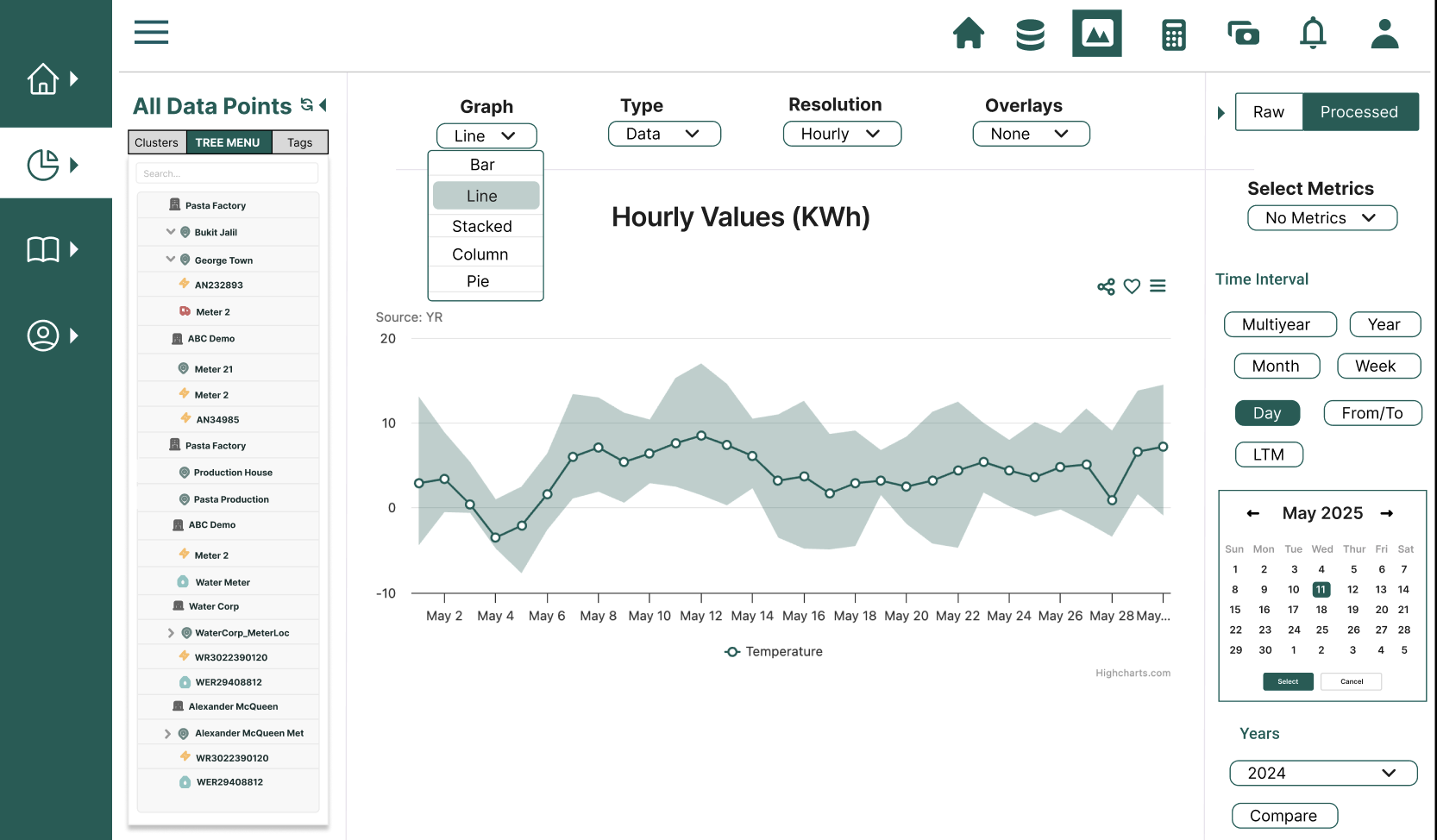
Data Pulse is the primary analytics interface of the platform. Users can explore energy consumption data across different time resolutions, metric types, and data sources — from half-hourly interval data down to individual sub-meters.
The core design challenge was giving users enough control to do powerful analysis without creating a tool that felt like it required training to operate.
- Main graph view — configurable chart type, time interval, metric, and data type
- Table view toggle — switch from visual to tabular data without losing context
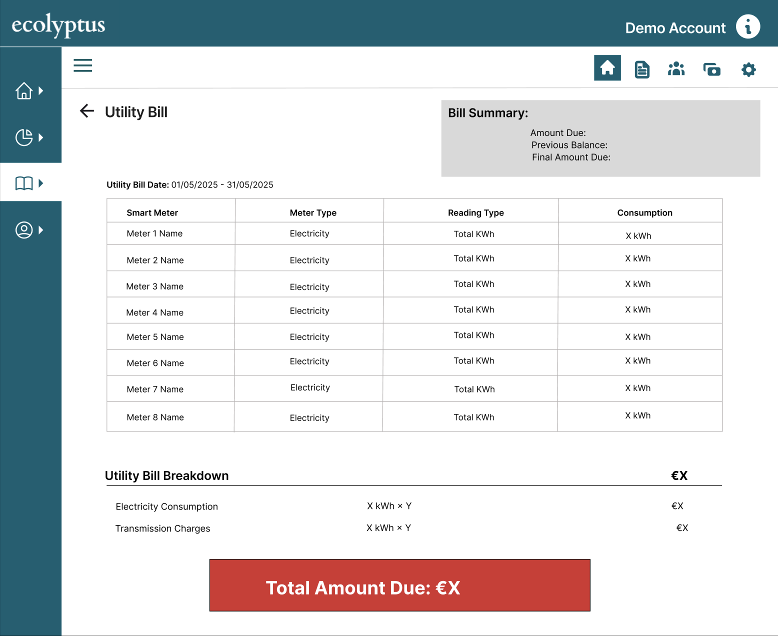
- Download options — export data in multiple formats directly from the chart view
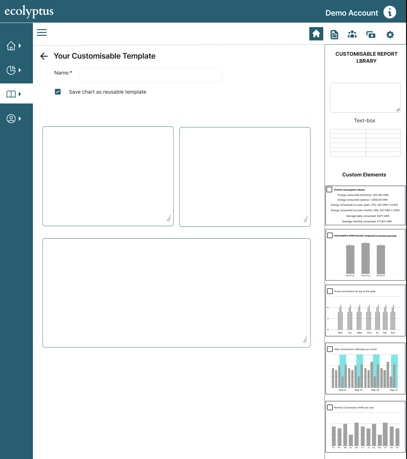
- Bookmark a chart — save any configured chart as a reusable element for reports
- Metrics / KPIs — add custom metrics as overlay indicators on any chart
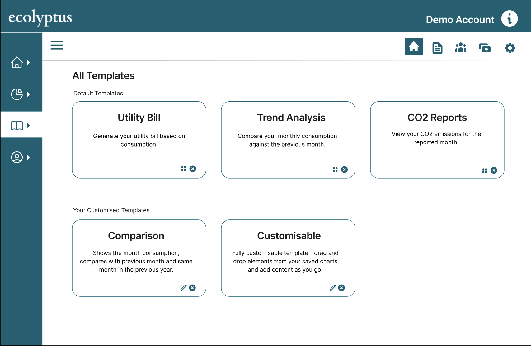
- Bookmarks library — manage and reuse saved chart configurations across modules
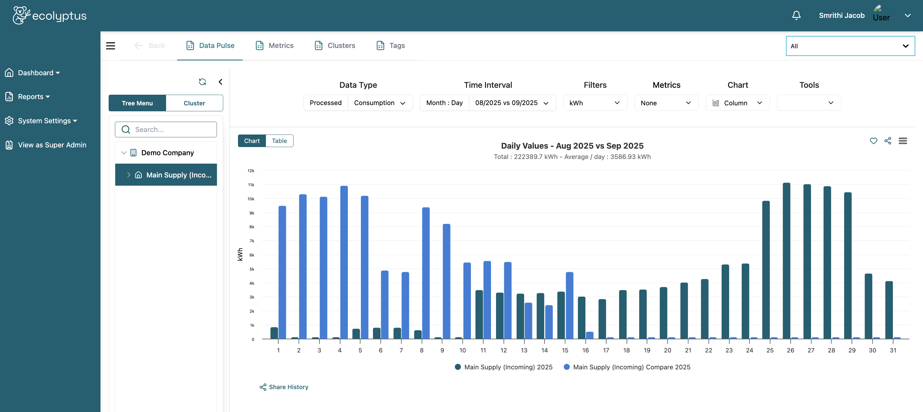
Main Graph View
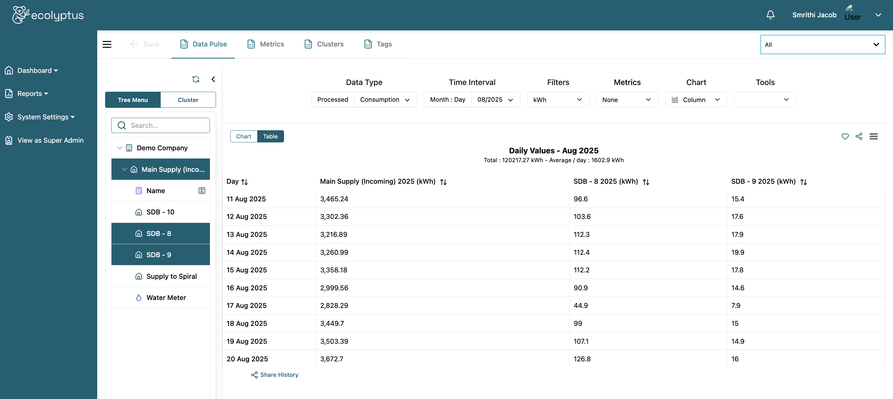
Table View
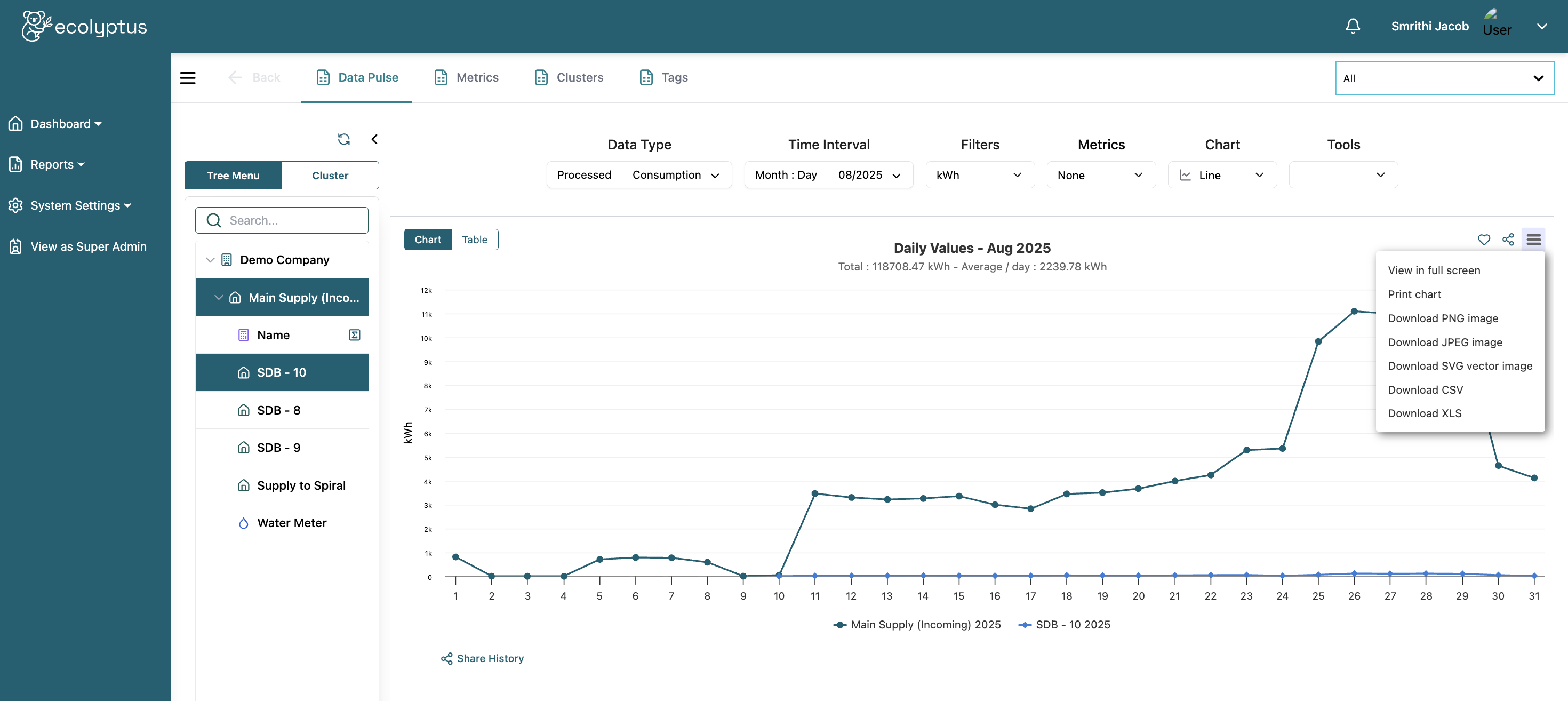
Download Options
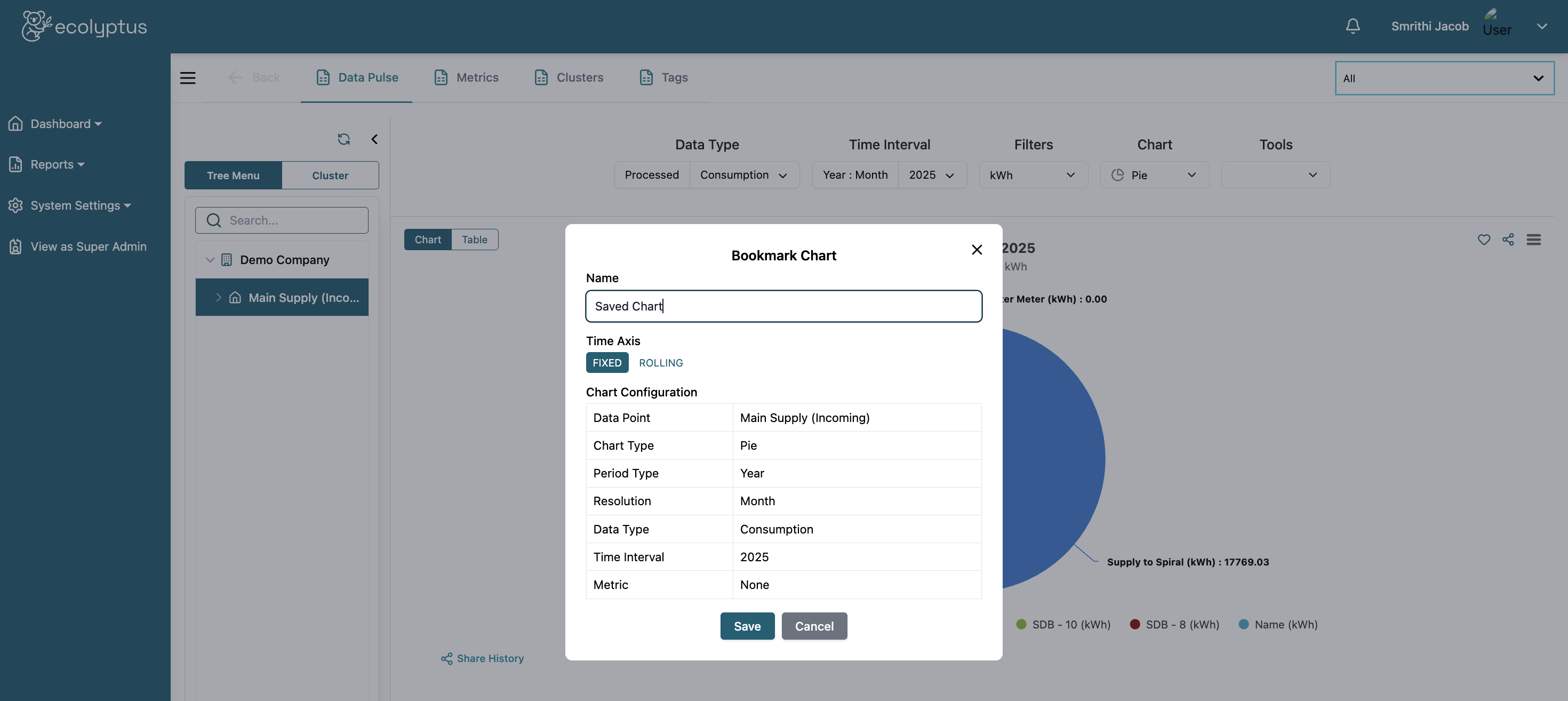
Bookmark A Chart
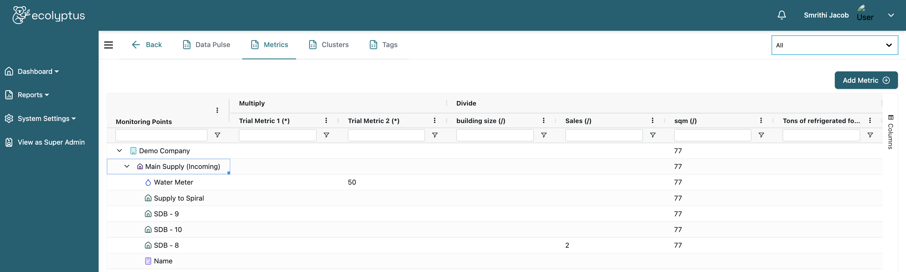
Add A Metric (KPI)
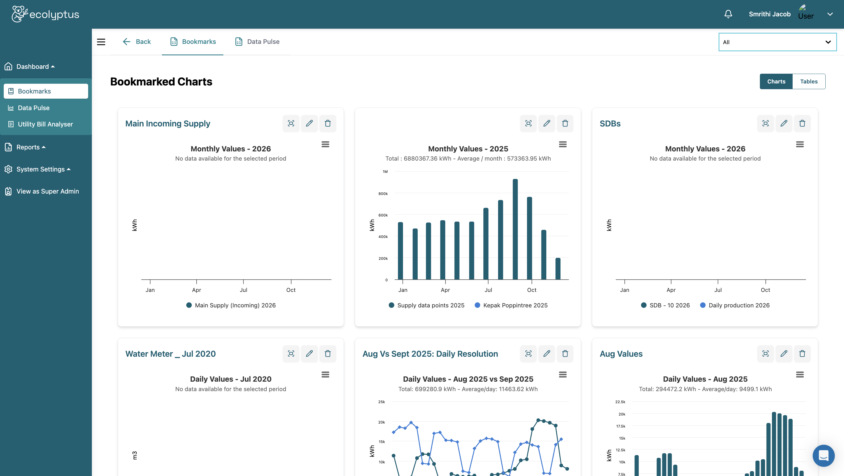
Bookmarked Charts
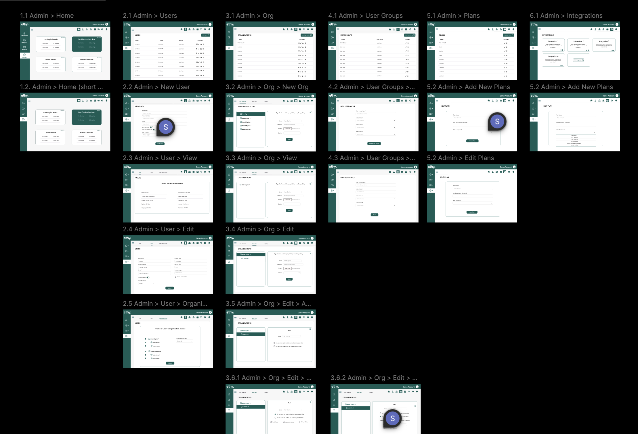
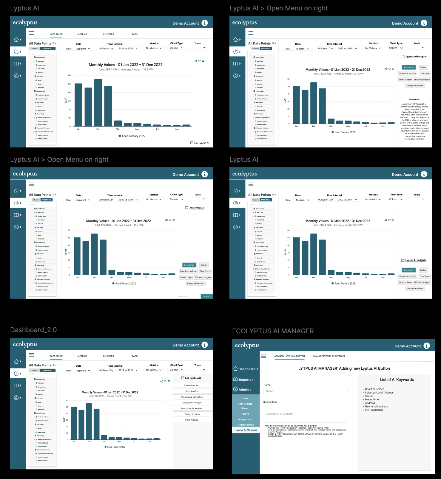
Design Iteration
Early vs. iterated designs
Early designs focused on exposing raw data and charting flexibility. Through iteration I refined visual hierarchy to prioritise key insights, simplified controls, and ensured charts could be reused across modules without redesign.
Early Design
Iterated Design